ABOUT BRAND
eomoteのコンセプト
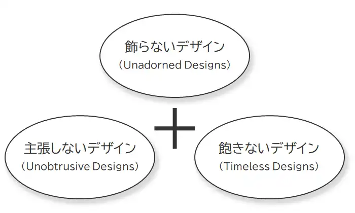
Simple is Best
eomote(エオモテ)は、「Simple is Best」をコンセプトに、飾らないデザイン、主張しないデザイン、飽きないデザインが特徴の東京発のオリジナルブランドです。eomote is an original brand from Tokyo that is based on the concept of "Simple is Best" and is characterized by unadorned, unobtrusive, and timeless designs.
シンプルなデザインは、現代のデザインの中で注目される傾向にあり、流行に左右されず、長い間愛され続けることができる魅力を持っています。
Simple designs tend to attract attention in modern design.It has a charm that will continue to be loved for a long time without being influenced by trends.
飾らないデザイン
Unadorned Designs
eomoteは、どんな環境にも合うように、飾らないデザインを目指しています。eomote aims for an unadorned design that fits in any environment.
主張しないデザイン
Unobtrusive Designs
eomoteは、どんなスタイルにも合うように、主張しないデザインを目指しています。eomote aims for an unobtrusive design that fits any style.
飽きないデザイン
Timeless Designs
eomoteは、トレンドに流されないように、飽きないデザインを目指しています。eomote aims to create timeless designs that will not be influenced by trends.
eomoteの由来
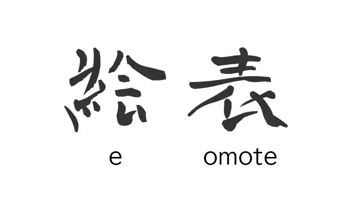
The name eomote is based on the idea that infinite design possibilities are created by drawing a picture on the front.
eomote(エオモテ)の一部のコンテンツ(漢字ロゴなど)では、書家の青柳疎石先生が書かれた躍動感溢れる字母を青柳衡山先生がフォント化された青柳疎石フォントを利用させていただいております。
[青柳疎石フォント関連]
・武蔵システム
・青二書道教室